BRANDING + WEBSITE DESIGNJoanna Sanchez: Life & Embodiment Coach
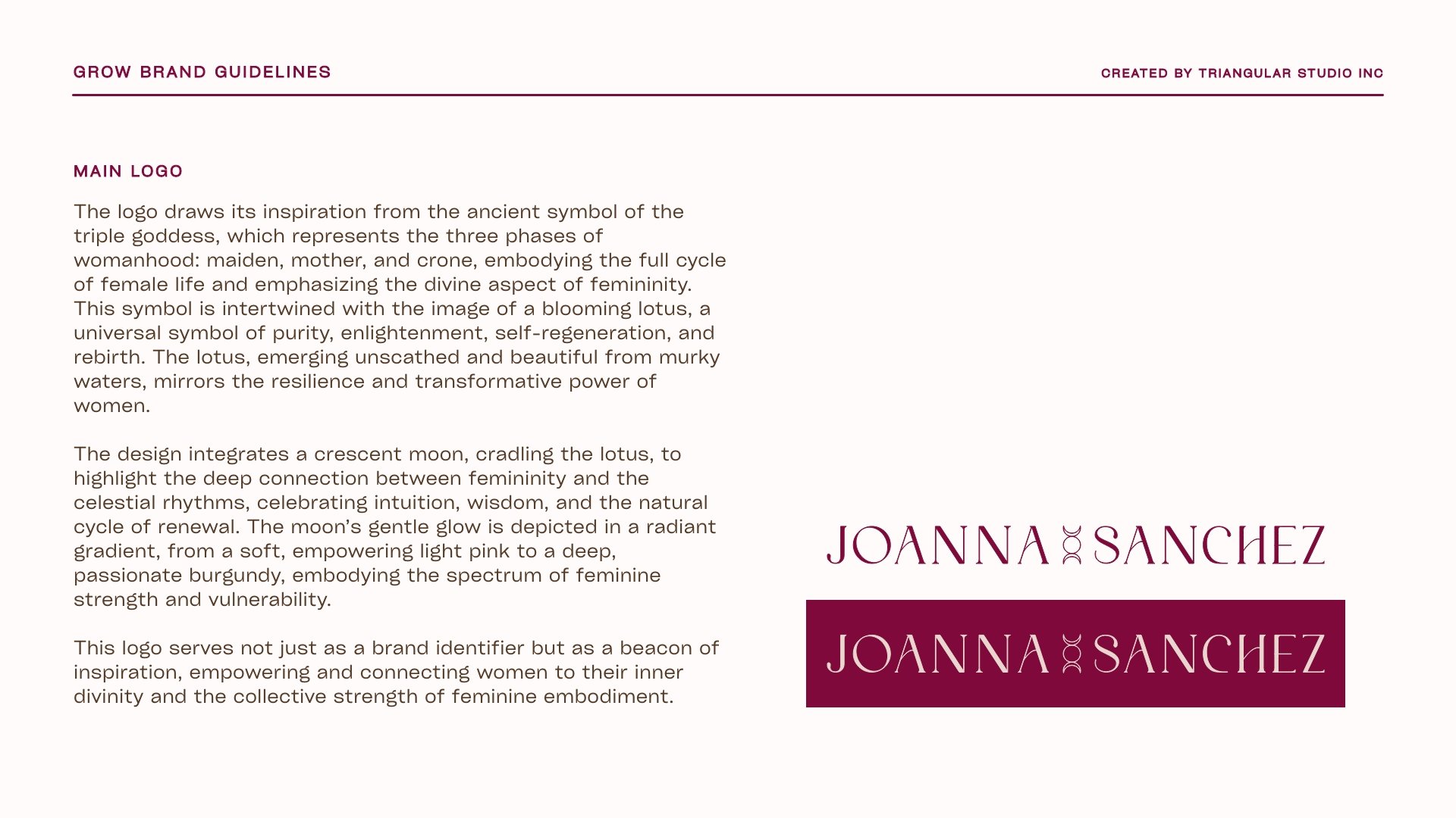
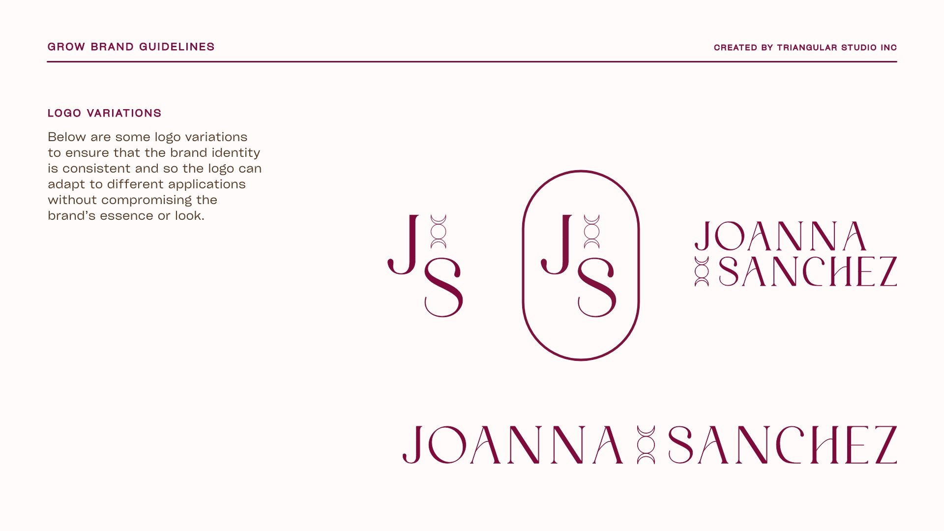
We drew inspiration for her logo and brand from the ancient triple goddess symbol, representing the three phases of womanhood: maiden, mother, and crone, embodying the full cycle of female life and emphasizing the divine aspect of femininity.
The design integrates a crescent moon to highlight the deep connection between femininity and the celestial rhythms, celebrating intuition, wisdom, and the natural renewal cycle. The moon’s gentle glow is depicted in a radiant gradient, from a soft, empowering light pink to a deep, passionate burgundy, embodying the spectrum of feminine strength and vulnerability.
This logo serves as a brand identifier and a beacon of inspiration, empowering and connecting women to their inner divinity and the collective strength of feminine embodiment.
our process


the brand
